Links til sider om farveteori
JOHANNES ITTEN
[1888-1967]
Farvekontraster.
Bauhaus.
Johannes Itten: Online
“The Elements of Colour”.
Findes på dansk med titlen: Farvekunstens elementer
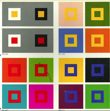
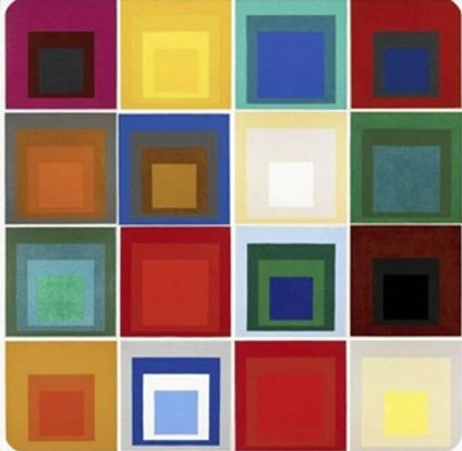
JOSEPH ALBERS
[1888-1976]
Farvekarakter:
Bauhaus.
Joseph Albers:
Online
“The Interaction of Colour”
Findes på dansk med titlen: Farvernes relation
Inspiration:
Josef & Anni Albers Foundation
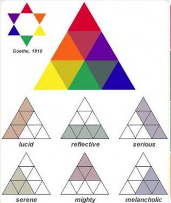
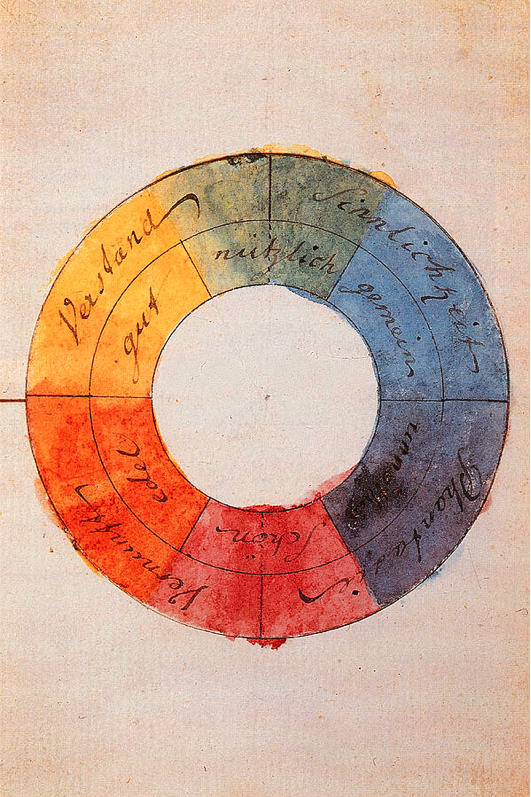
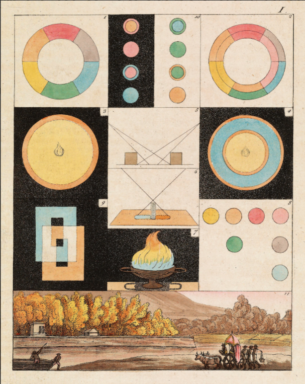
JOHANN WOLFGANG VON GOETHE
[1749-1832]
Om J.W. Goethe:
The Theory of Colour
[Originalteksten er
vanvittig tung
at overskue].
Om Newtons farveteori som inspirerer Goethe
Smithsonian Libraries
–––––––––––––––––––––––––––––––––––––––––––––
Text: JOHANN WOLFGANG VON GOETHE [1749-1832].
Color is a degree of darkness
YELLOW
This is the color nearest the light. It appears on the slightest mitigation of light, whether by semi-transparent mediums or faint reflection from white surfaces. In prismatic experiments it extends itself alone and widely in the light space, and while the two poles remain separated from each other, before it mixes with blue to produce green it is to be seen in its utmost purity and beauty. How the chemical yellow develops itself in and upon the white, has been circumstantially described in its proper place.
… In its highest purity it always carries with it the nature of brightness, and has a serene, gay, softly exciting character.
State is agreeable and gladdening, and in its utmost power is serene and noble, it is, on the other hand, extremely liable to contamination, and produces a very disagreeable effect if it is sullied, or in some degree tends to the minus side. Thus, the color of sulphur, which inclines to green, has a something unpleasant in it.
… When a yellow color is communicated to dull and coarse surfaces, such as common cloth, felt, or the like, on which it does not appear with full energy, the disagreeable effect alluded to is apparent. By a slight and scarcely perceptible change, the beautiful impression of fire and gold is transformed into one not undeserving the epithet foul; and the color of honour and joy reversed to that of ignominy and aversion. To this impression the yellow hats of bankrupts and the yellow circles on the mantles of Jews, may have owed their origin.
RED-YELLOW
As no color can be considered as stationary, so we can very easily augment yellow into reddish by condensing or darkening it. The color increases in energy, and appears in red-yellow more powerful and splendid.
… All that we have said of yellow is applicable here, in a higher degree. The red-yellow gives an impression of warmth and gladness, since it represents the hue of the intenser glow of fire.
YELLOW-RED
As pure yellow passes very easily to red-yellow, so the deepening of this last to yellow-red is not to be arrested. The agreeable, cheerful sensation which red-yellow excites increases to an intolerably powerful impression in bright yellow-red.
… The active side is here in its highest energy, and it is not to be wondered at that impetuous, robust, uneducated men, should be especially pleased with this color. Among savage nations the inclination for it has been universally remarkedy and when children, left to themselves, begin to use tints, they never spare vermilion and minium.
In looking steadfastly at a perfectly yellow-red surface, the color seems actually to penetrate the organ. It produces an extreme excitement, and still acts thus when somewhat darkened. A yellow-red cloth disturbs and enrages animals. I have known men of education to whom its effect was intolerable if they chanced to see a person dressed in a scarlet cloak on a grey, cloudy day.
The colors on the minus side are blue, red-blue, and blue-red. They produce a restless, susceptible, anxious impression.
BLUE
As yellow is always accompanied with light, so it may be said that blue still brings a principle of darkness with it.
… This color has a peculiar and almost indescribable effect on the eye. As a hue it is powerful — but it is on the negative side, and in its highest purity is, as it were, a stimulating negation. Its appearance, then, is a kind of contradiction between excitement and repose.
… As the upper sky and distant mountains appear blue, so a blue surface seems to retire from us.
… But as we readily follow an agreeable object that flies from us, so we love to contemplate blue — not because it advances to us, but because it draws us after it.
… Blue gives us an impression of cold, and thus, again, reminds us of shade. We have before spoken of its affinity with black.
… Rooms which are hung with pure blue, appear in some degree larger, but at the same time empty and cold.
… The appearance of objects seen through a blue glass is gloomy and melancholy.
… When blue partakes in some degree of the plus side, the effect is not disagreeable. Sea-green is rather a pleasing color.
RED-BLUE
We found yellow very soon tending to the intense state, and we observe the same progression in blue.
… Blue deepens very mildly into red, and thus acquires a somewhat active character, although it is on the passive side. Its exciting power is, however, of a different kind from that of the red-yellow. It may be said to disturb, rather than enliven.
… As augmentation itself is not to be arrested, so we feel an inclination to follow the progress of the color, not, however, as in the case of the red-yellow, to see it still increase in the active sense, but to find a point to rest in.
… In a very attenuated state, this color is known to us under the name of lilac; but even in this degree it has a something lively without gladness.
BLUE-RED
This unquiet feeling increases as the hue progresses, and it may be safely assumed, that a carpet of a perfectly pure deep blue-red would be intolerable. On this account, when it is used for dress, ribbons, or other ornaments, it is employed in a very attenuated and light state, and thus displays its character as above defined, in a peculiarly attractive manner.
… As the higher dignitaries of the church have appropriated this unquiet color to themselves, we may venture to say that it unceasingly aspires to the cardinal’s red through the restless degrees of a still impatient progression.
RED
Whoever is acquainted with the prismatic origin of red will not think it paradoxical if we assert that this color partly actu, partly potentia, includes all the other colors.
… We have remarked a constant progress or augmentation in yellow and blue, and seen what impressions were produced by the various states; hence it may naturally be inferred that now, in the junction of the deepened extremes a feeling of satisfaction must succeed ; and thus, in physical phenomena, this highest of all appearances of color arises from the junction of two contrasted extremes which have gradually prepared themselves for a union.
… As a pigment, on the other hand, it presents itself to us already formed, and is most perfect as a hue in cochineal ; a substance which, however, by chemical action may be made to tend to the plus or the minus side, and may be considered to have attained the central point in the best carmine. The effect of this color is as peculiar as its nature. It conveys an impression of gravity and dignity, and at the same time of grace and attractiveness.
… The first in its dark deep state, the latter in its light attenuated tint; and thus the dignity of age and the amiableness of youth may adorn itself with degrees of the same hue.
… History relates many instances of the jealousy of sovereigns with regard to the quality of red. Surrounding accompaniments of this color have always a grave and magnificent effect. The red glass exhibits a bright landscape in so dreadful a hue as to inspire sentiments of awe.
GREEN
If yellow and blue, which we consider as the most fundamental and simple colors, are united as they first appear, in the first state of their action, the color which we call green is the result.
… The eye experiences a distinctly grateful impression from this color. If the two elementary colors are mixed in perfect equality so that neither predominates, the eye and the mind repose on the result of this junction as upon a simple color. The beholder has neither the wish nor the power to imagine a state beyond it. Hence for rooms to live in constantly, the green color is most generally selected.
